
Chobani
Chobani Wonders
Spring 2025
Rebrand of Chobani Wonders. Soft, hand-drawn illustrations that visualize the anticipation and delight taste discovery.
Topic
Brand Identity
UI/UX
Motion
Packaging
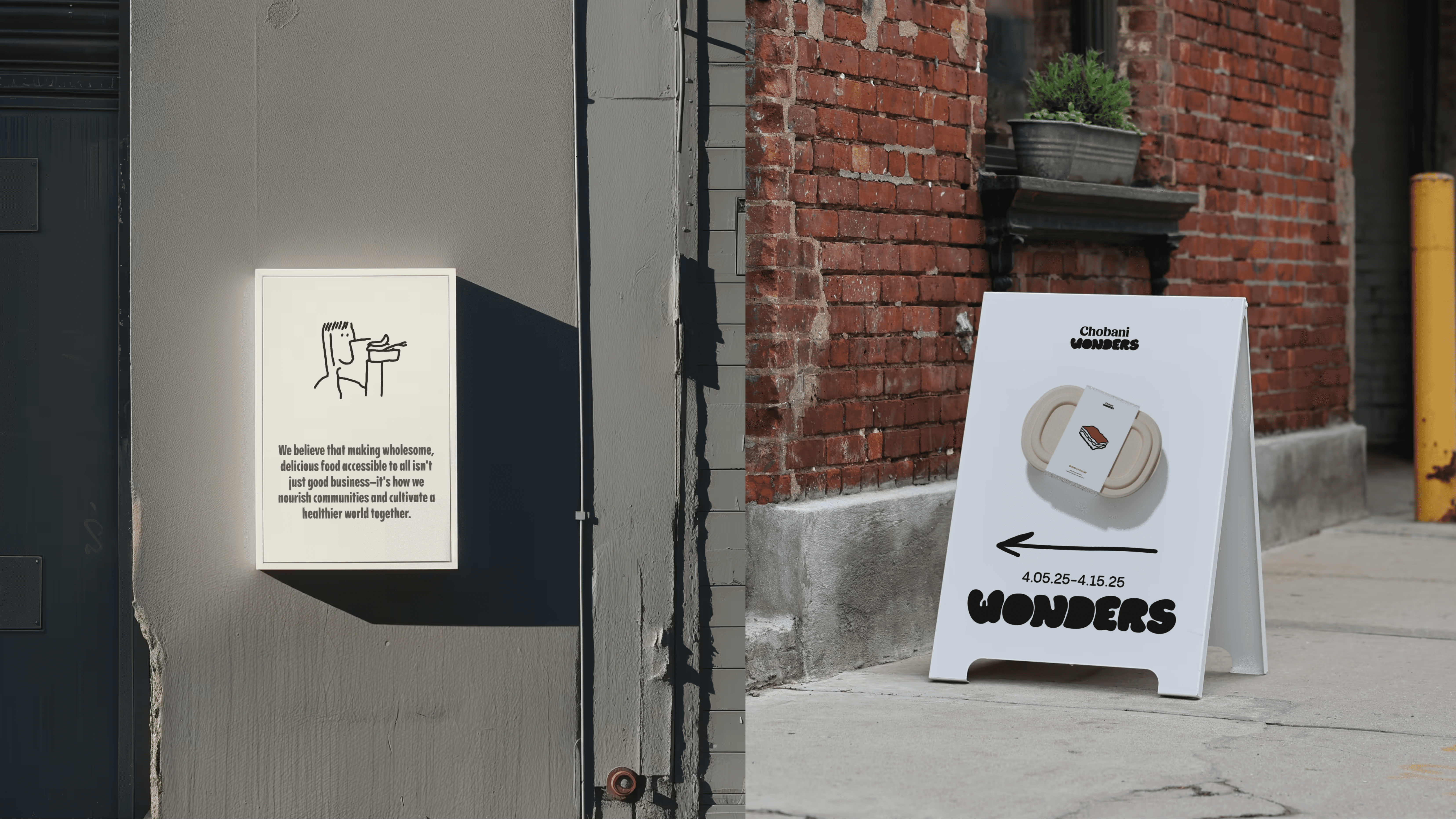
Signage
Strategy
Tools Used
Figma
Illustrator
Photoshop
Indesign
Midjourney
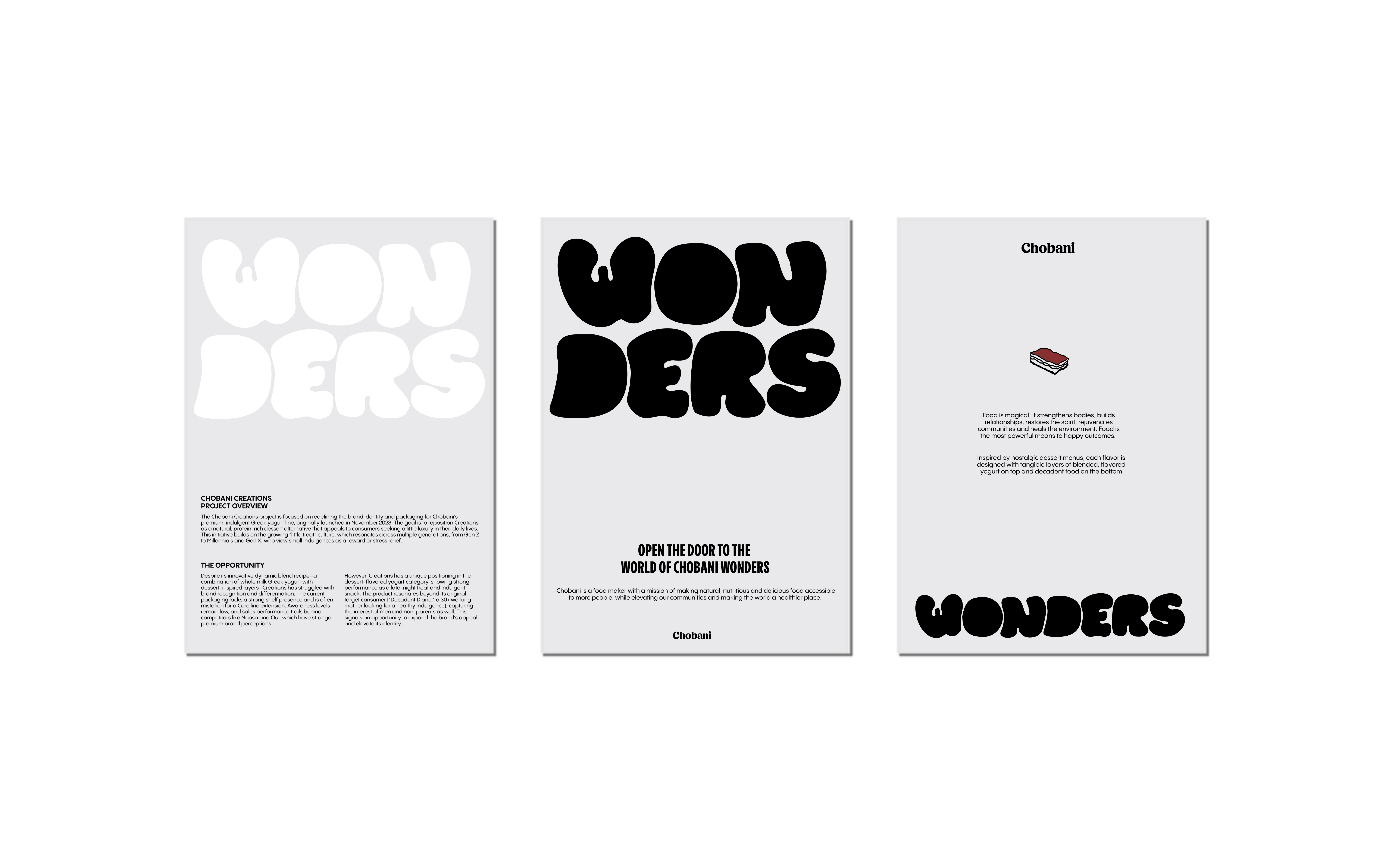
Overview
The Motivation
Food has always been more than just sustenance to me. It's how we create memories, build connections, and express care for another. I've always been fascinated by how the right visual approach can make food feel more inviting, more special, more human.
While drawing up ideas for the project, I kept coming back to one specific moment: Watching a child try a new ice cream flavor for the first time. That split second of curiosity, the careful first taste, and then (if you're lucky) that amazing expression of pure delight.
'What about there is a brand that could capture that authentic moment of wonder?" This wasn't just about making another dessert line look appealing. It was about honoring the real human experience of discovering something delicious and making that feeling accessible through thoughtful design.
This project became the exploration of how design can acknowledge and enhance the emotional side of food, turning everyday moments into something worth savoring.
Concept
Design Strategy
The visual system needed to work across multiple touchpoints. Every element reinforces the core idea that trying WONDERS should feel like a small celebration, whether you are 5 or 55. The target audience is set to primary: families with children aged 4-12 who value quality ingredients and shared food experiences, and secondary: adults who appreciate thoughtful design and want desserts that feel special rather than guilty.

System
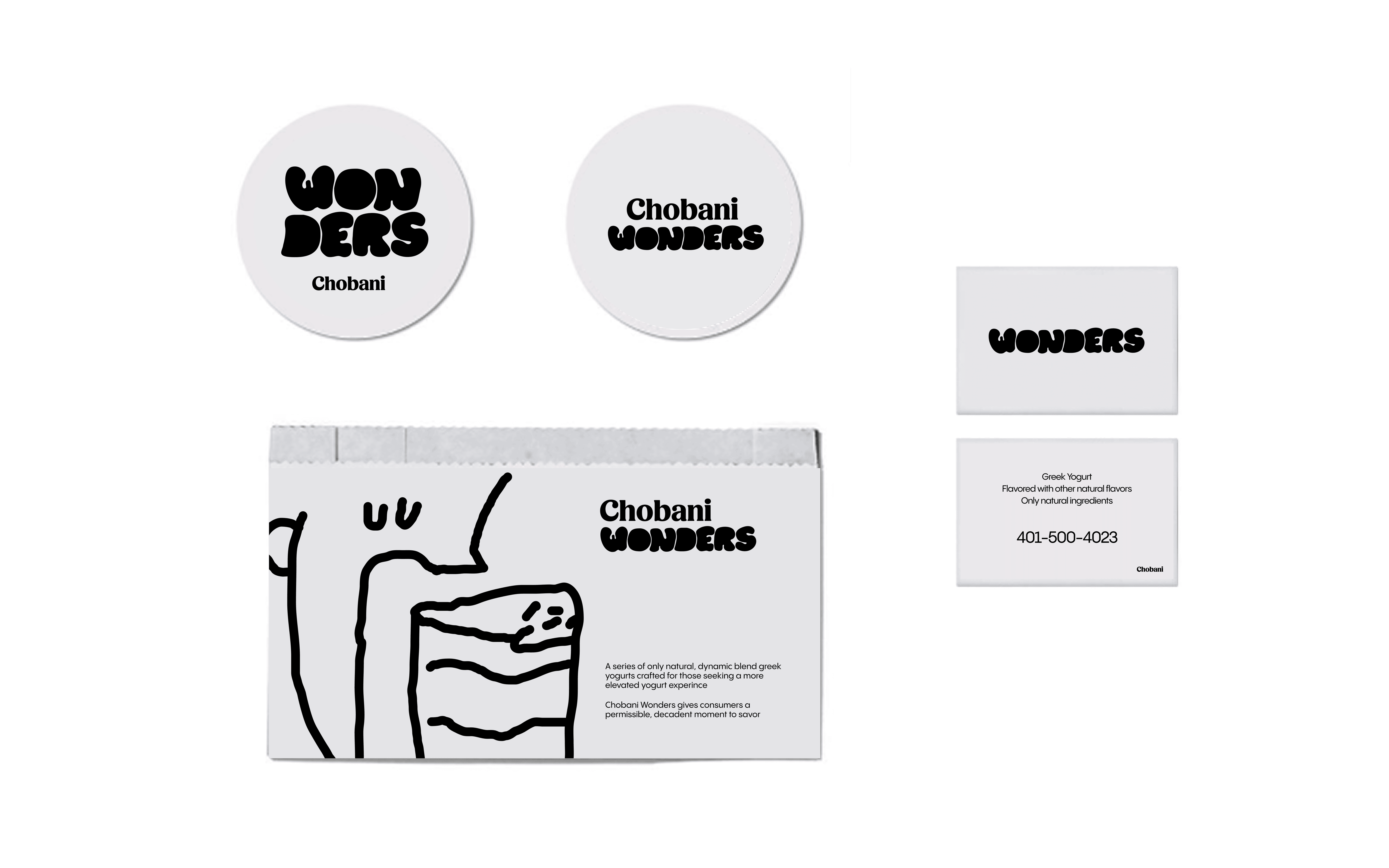
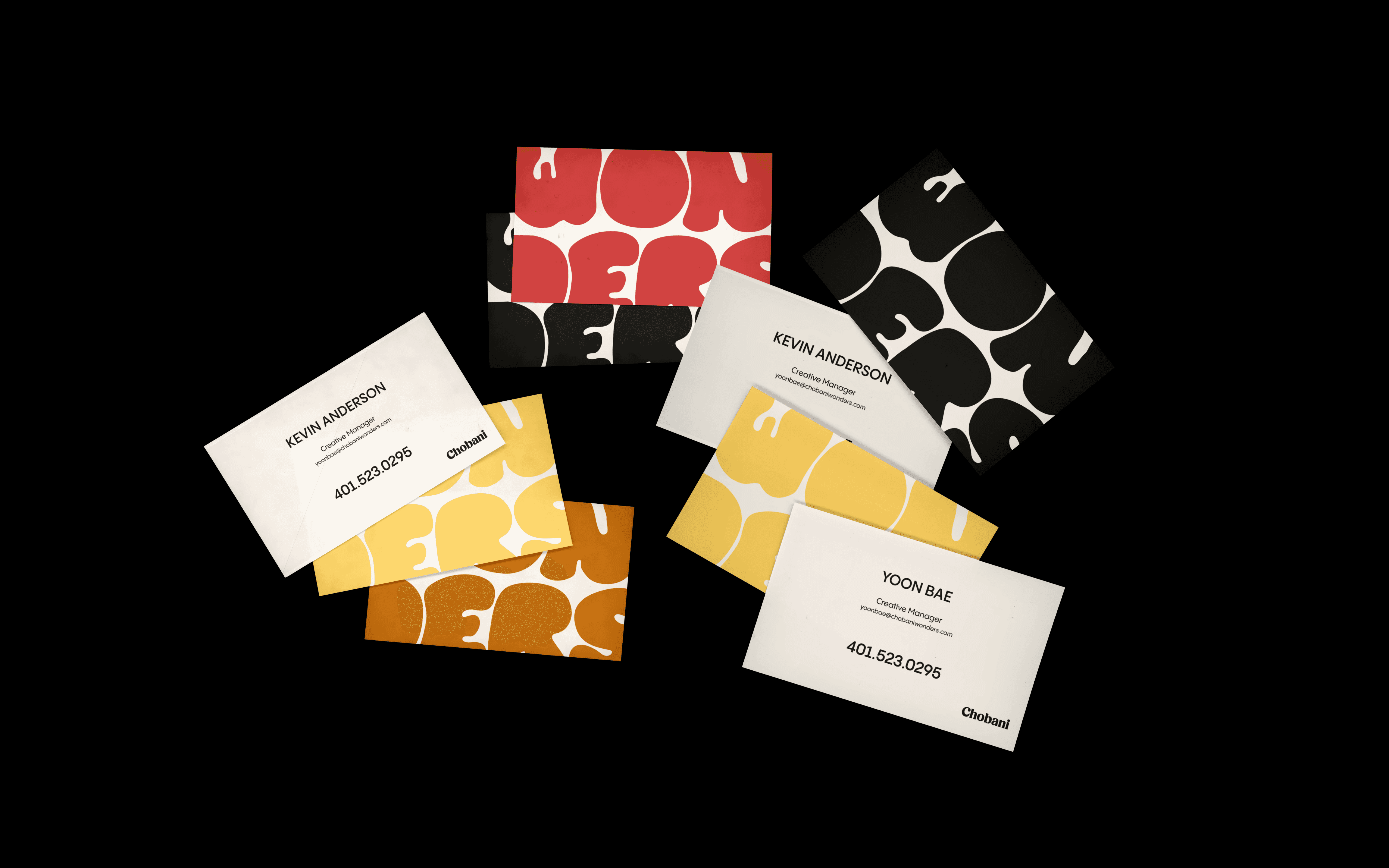
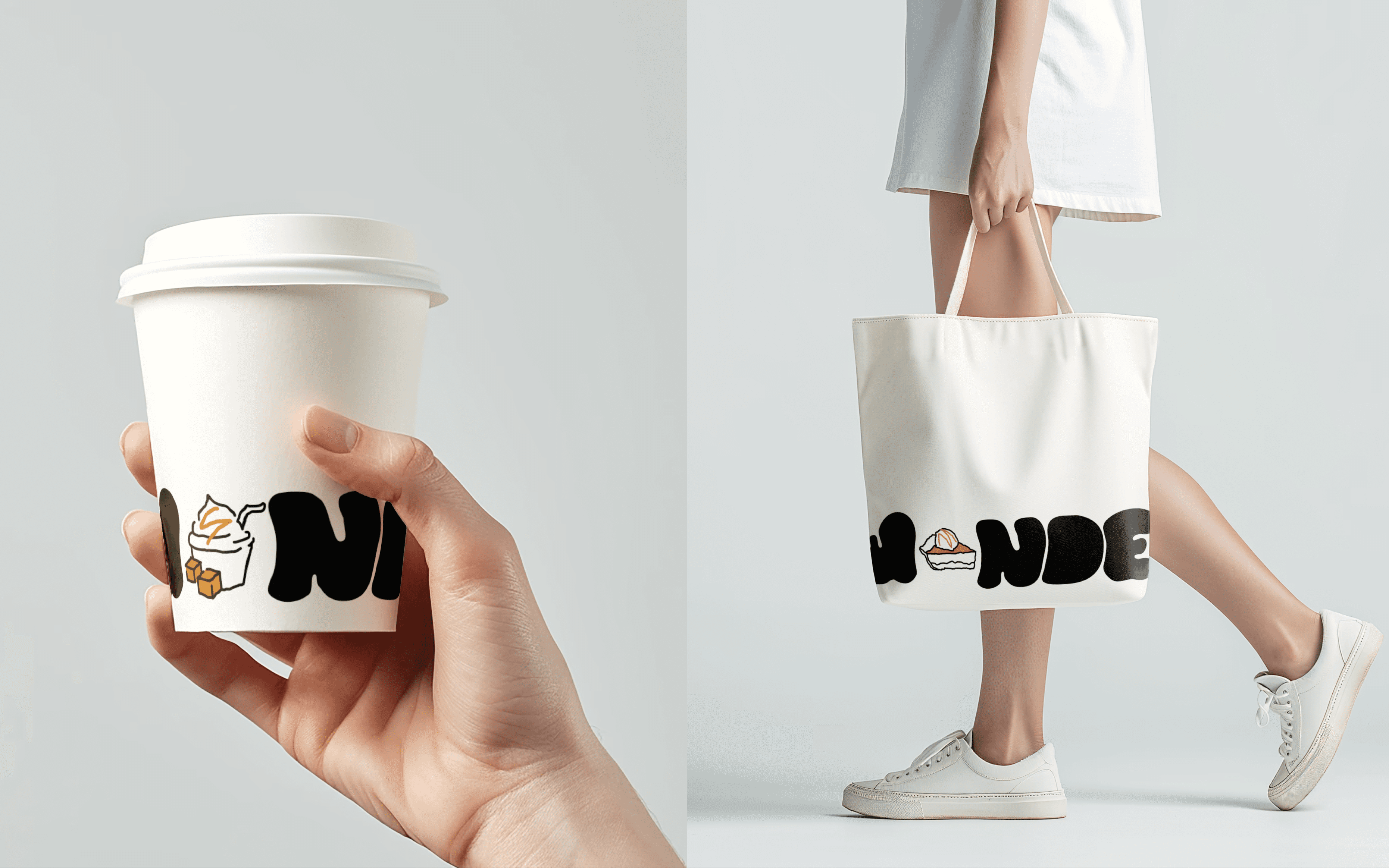
Logo & Typography
The logo was created so it could speak to both kids and parents.
The hand-drawn illustrations went through multiple iterations to find the right balance of detail and simplicity. Too polished, and they'd lose their human quality. Too rough, and they wouldn't work across all applications.
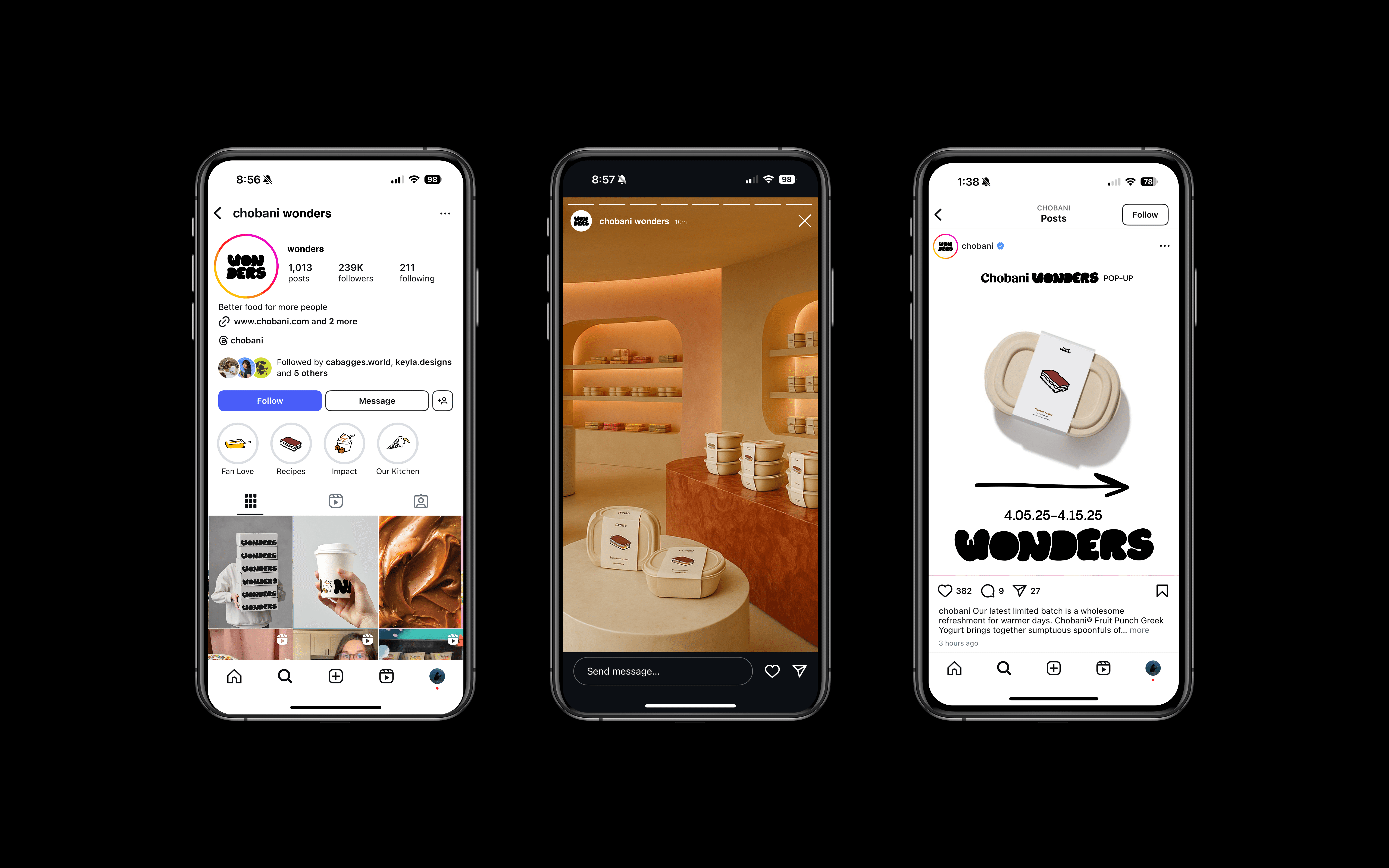

The WONDER Experience
Together, these elements create a brand ecosystem that transforms routine yogurt into moments of anticipation and delight. Whether someone encounters WONDERS through packaging, events, or brand extensions, they experience the same gentle invitation to slow down and savor something special.
Takeaway
Working on WONDERS taught me that the most powerful branding doesn't shout for attention but invites people in with warmth and genuine care for their experience. This project proved to me that when you design with empathy and authenticity, focusing on real human emotions rather than just aesthetics, you create something that resonates on a much deeper level.